KPI indicator for understanding threshold parameters in Power BI
- Abhay Khullar

- Jul 6, 2019
- 3 min read
Updated: Jul 8, 2019
In our consulting engagements, we do come across situations where we have to analyze specific measures and then understand how they compare against threshold or industry defined benchmark values. The comparison drawn is then expected to be projected in a tabular view with the values which are crossing the benchmark values highlighted in separate color than the ones below benchmark.
The objective is to enable the end user or product owner to easily identify problematic records and zero in on the root cause behind the low values to make business informed decisions for targeting relevant business segments. This ensures that the entire process of identifying the dismal values and investigating the reasoning behind it to focus on concern areas becomes an easily workable task.
This article will focus on traffic light indicator in Power BI table which is based on the concept of conditionally formatting the font color of a UNICHAR circle based on another column.
We will be using Adventure-works sales and Adventure-works product file for this use case.
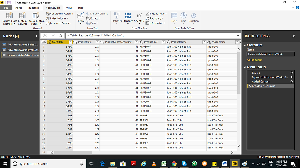
Using Get data tab we injected both Sales and product csv file in PowerBI and then did a join on product key before using query editor for merging both the files using left outer join to create a new file which is a complete Report data of Adventure works.

Every day we come across numerous posts, blogs and even video tutorials on how to create brilliant but complex charts, that might not be quite useful at your own organization. Some require data densification while others don't end up well with huge data sets.
Design with Ease
We @thevizduo.com garners handy yet useful tips that can be used with ease on a daily basis to attain better productivity at your workplace

Now we create a calculated column titled Sales which is a product of Product price * Quantity. I then use the move function to reorder the newly created Sales2017 column to start of table.

Now close and apply the changes.
Now we will create a simple Tabular view in Power BI as shown below:
We will then create a ‘KPI Light’ variable by right clicking on any value and selecting ‘new column’. The value will be added as UNICHAR(11044) to create black circle. Now drag this variable in tabular view.

Now we drag the ‘KPI Light’ variable in Tabular view and use conditional formatting for font color as shown below:

In the conditional formatting window select ‘format by rules’ from the drop down and select ‘Sales2017’ field which will be summarized as sum. Now write the following 3 conditions as shown in image below:

Click ‘Ok’ and there you have it, the KPI indicator with light pattern for ease of identifying values less than threshold values.
You can even dynamically set the threshold values which I will discuss in the follow up article.
Till then
Happy Analyzing!
an article by Abhay Khullar

Abhay Khullar consult organizations on Business Analytics, Machine Learning and Data Visualization. He is experienced in research and analysis in new business opportunities, adjacent market segments, new product ideas, go-to-market strategies and globalization.
He has worked on several engagements in consumer products, F&B, oral care, cosmetics and health care. Adept in solving business problems using Business Analytics and Machine Learning methodologies.
After starting his career 9 years back in Mainframe DB2, he moved onto Analytics domain and held various roles. Mostly working with CXOs, IT infrastructure managers and students, he has always been focusing on building knowledge and end-to-end solutions in Business Analytics and Data Visualization.
He is an expert in creating numerical models for statistical analysis on research data and building financial models.
He is a certified Tableau and Six Sigma green belt associate and also MBA in Operations/Supply Chain. He is also a core member and speaker at Delhi Tableau User Group.
Comments